Maintenance Trainer
Problem: Airbus Helicopters created a 3D simulator to train technicians on complex maintenance tasks, but instructors were underusing it in class. Navigating the software was cumbersome enough that trainers often preferred relying on physical mockups, missing out on the digital tool's flexibility.
Outcome: I mapped out 28 core usability friction points and presented six key interaction recommendations, including a dual-mode camera and a radial contextual menu. Engineering leads at Airbus Helicopters and Telespazio validated and approved the overall specification package.
Disclosure
Presented under non-disclosure constraints, proprietary internal tools and sensitive business metrics have been anonymized or generalized.
Context
Airbus Helicopters built the Virtual Maintenance Trainer (VMT) to help technicians practice helicopter maintenance across over fifty simulated failure scenarios. On paper, it offered a flexible way to scale training without needing constant access to expensive physical mockups, but it struggled to gain regular traction in actual classrooms.
The Challenge
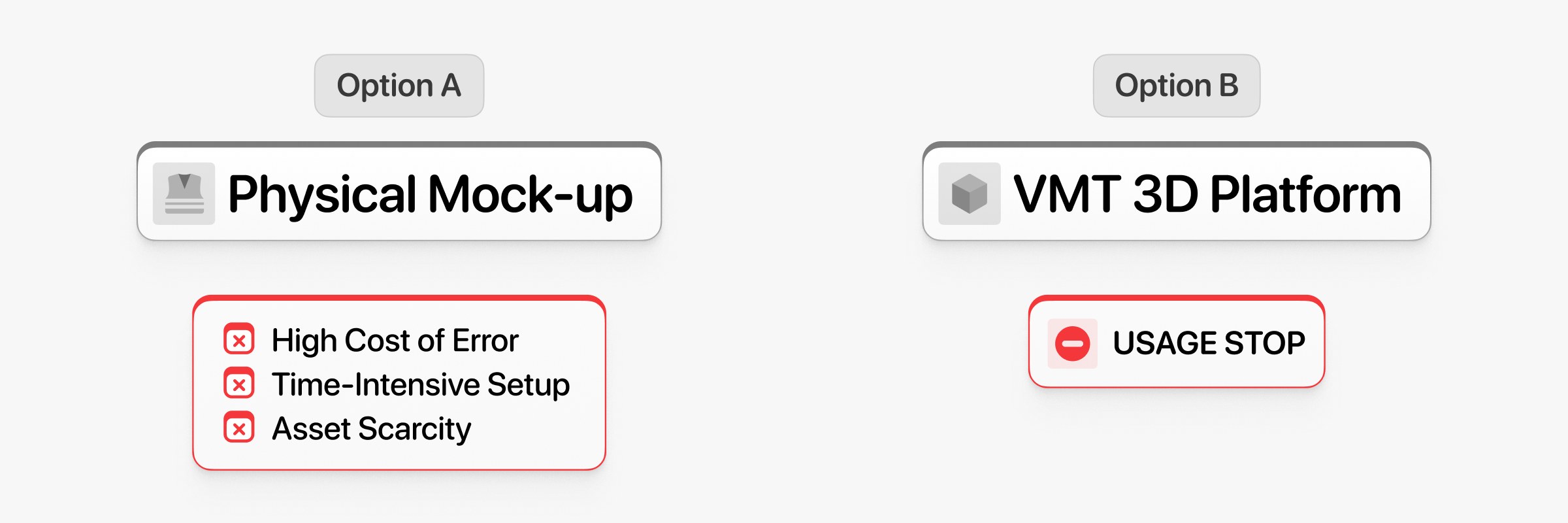
The primary goal was to fix low adoption rates. Instructors frequently set the simulator aside during live lessons in favor of paper manuals or physical aircraft mockups. My mission was to uncover why trainers avoided the software and provide practical recommendations to improve its intuitiveness and learning efficiency.
Scope
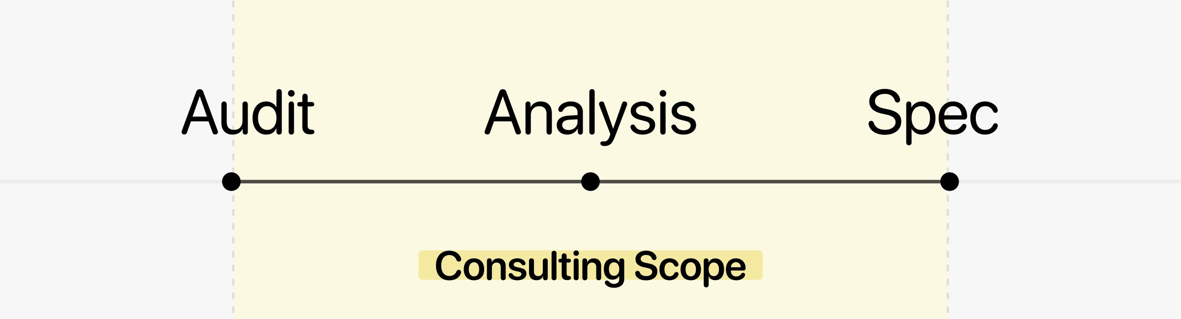
Working as a UX Consultant intern through the IMS Laboratory, my goal was to pinpoint the ergonomic friction points behind this low adoption and redesign the software interactions around real classroom teaching habits.
Discovery
To understand how the simulator operated, I did an initial walkthrough to catch obvious technical friction, such as navigation dead ends. I also reviewed three doctoral theses on aeronautical simulation learning to build a semi-structured interview grid tailored to the Airbus training environment.
Qualitative Research
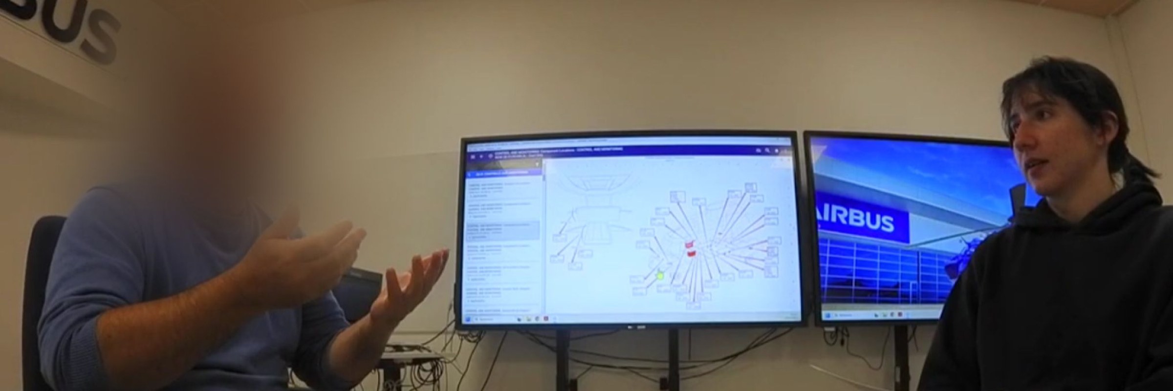
During this early phase, a key insight emerged: B2 Avionics instructors adapted to the same type of software easily, but B1.3 Mechanical instructors rejected it because the digital space offered no physical feedback for engine parts. To dig deeper, I went to Aérocampus Aquitaine and interviewed five instructors and two trainees about their frustrations, processing the transcriptions with WhisperAI.
Field Observations
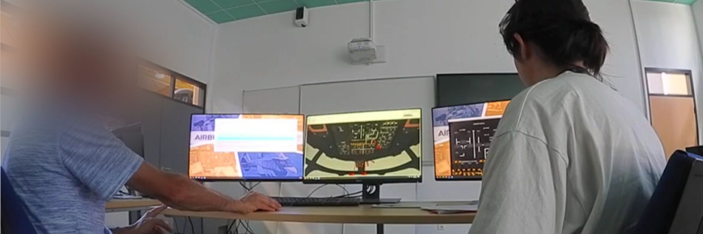
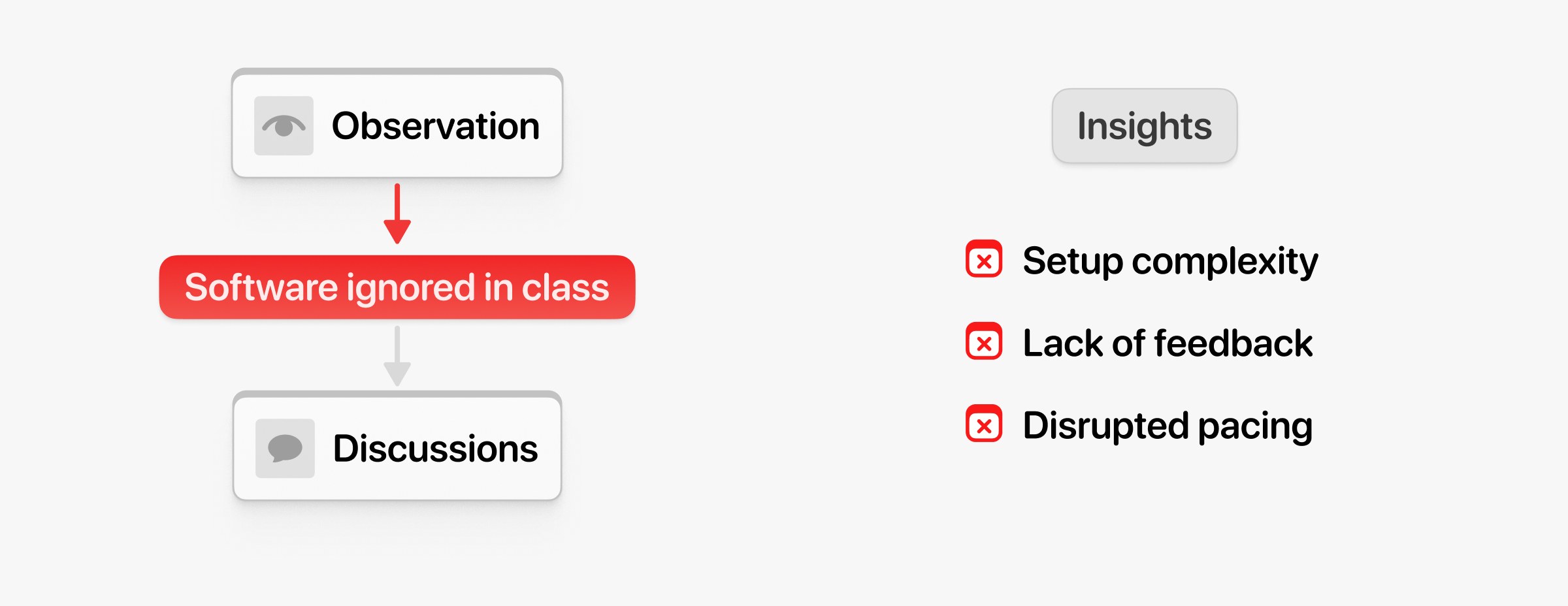
When observing live classes, I saw that instructors barely touched the simulator, defaulting immediately to physical mockups. I adapted my approach and started holding informal contextual discussions with them between training sessions. They explained that setting up and navigating around the 3D space took too much effort, breaking the natural pacing of their lessons.
Quantitative Data
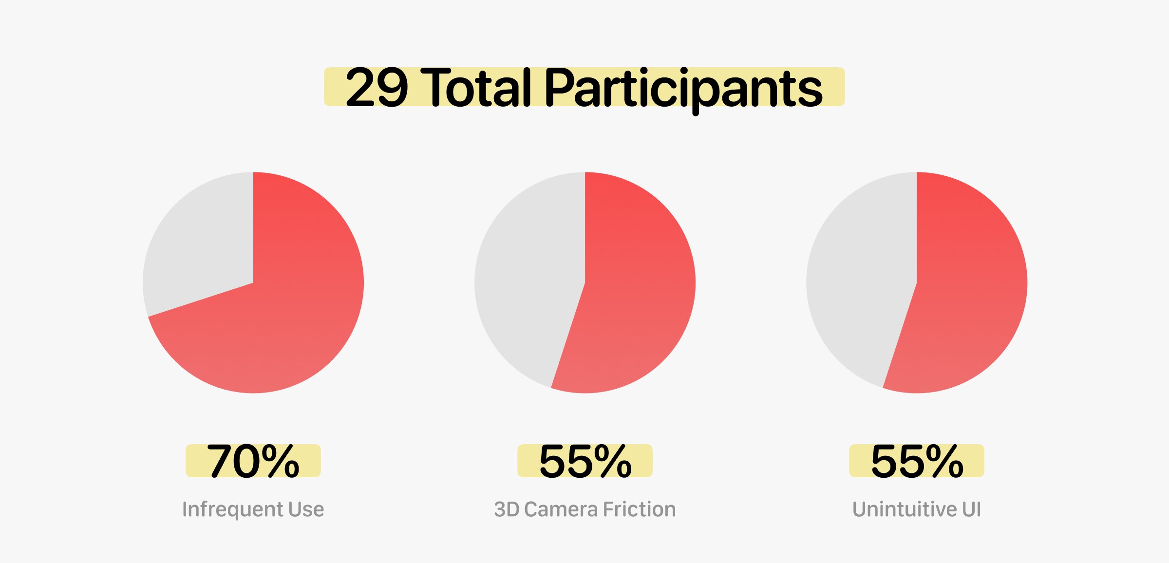
To support these conversations with hard data, I sent a survey to active instructors. I got 11 responses and combined them with an older internal Airbus study of 18 users. Looking at this group of 29 participants, the numbers confirmed a widespread trend: 70% used the software less than once a month, and 55% cited 3D camera movement and interface clarity as main obstacles.
Heuristic Synthesis
To structure these findings objectively, I categorized the interview and survey data using a 10-point ergonomic heuristic framework. This allowed me to systematically evaluate factors such as cognitive load and ergonomic transparency.
Key Issues
I mapped out 28 distinct usability issues and proposed 25 concrete recommendations to fix them. To keep this case study focused, I have isolated the three biggest friction points:
- unstandardized camera navigation disoriented users during engine inspections.
- nested menus constantly forced instructors to look away from the task while lecturing.
- selecting small 3D engine components required exact mouse accuracy with zero visual hover affordance.

Interaction Specification
Because my mission focused on interaction architecture rather than visual assets, I created interaction guidelines to solve those specific problems.
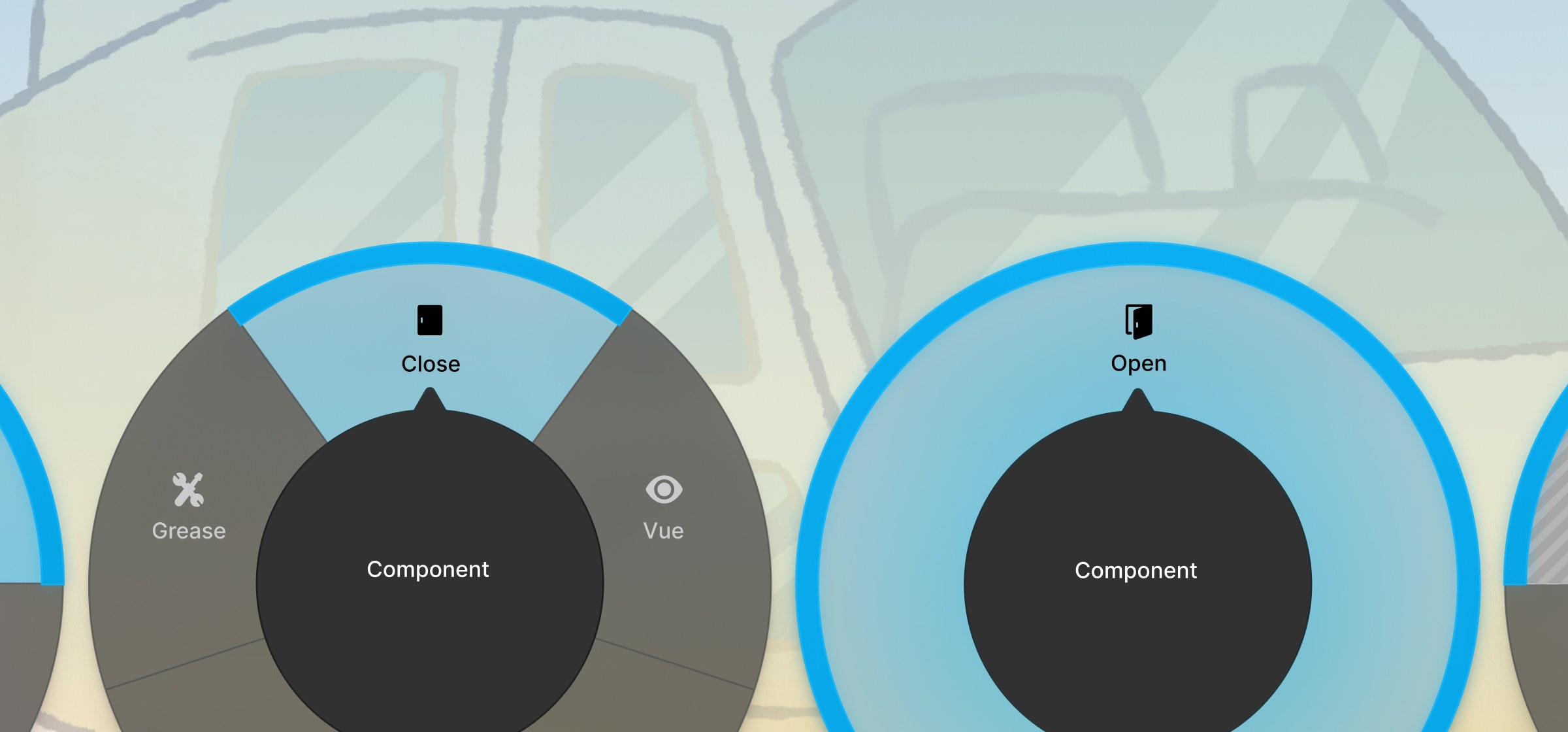
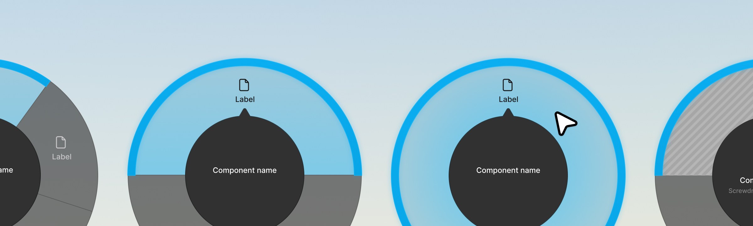
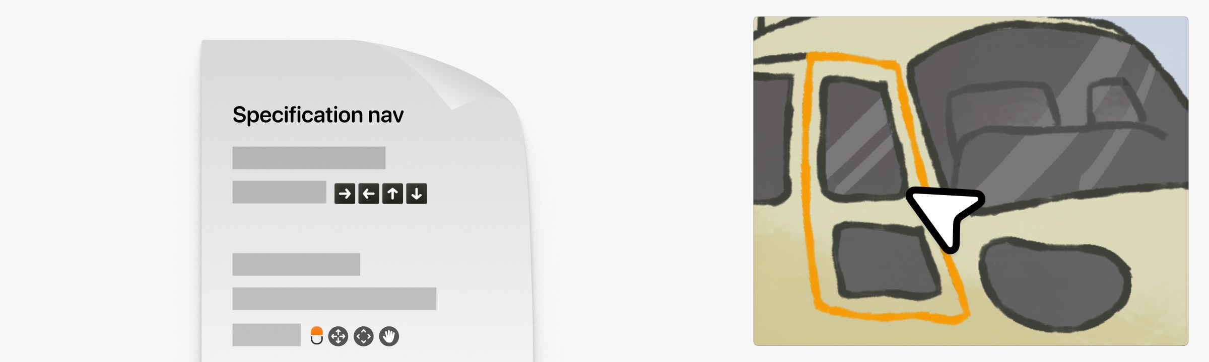
I proposed a dual-mode camera system combining standard WASD movement for navigating rooms with automatic orbit controls centered on selected components. To reduce menu dependency, I designed a cursor-anchored radial menu using Fitts’s Law to give instant access to common actions. Finally, I specified permissive click tolerances, component outlining, and structured error messages to eliminate guesswork.
Outcomes and Takeaways
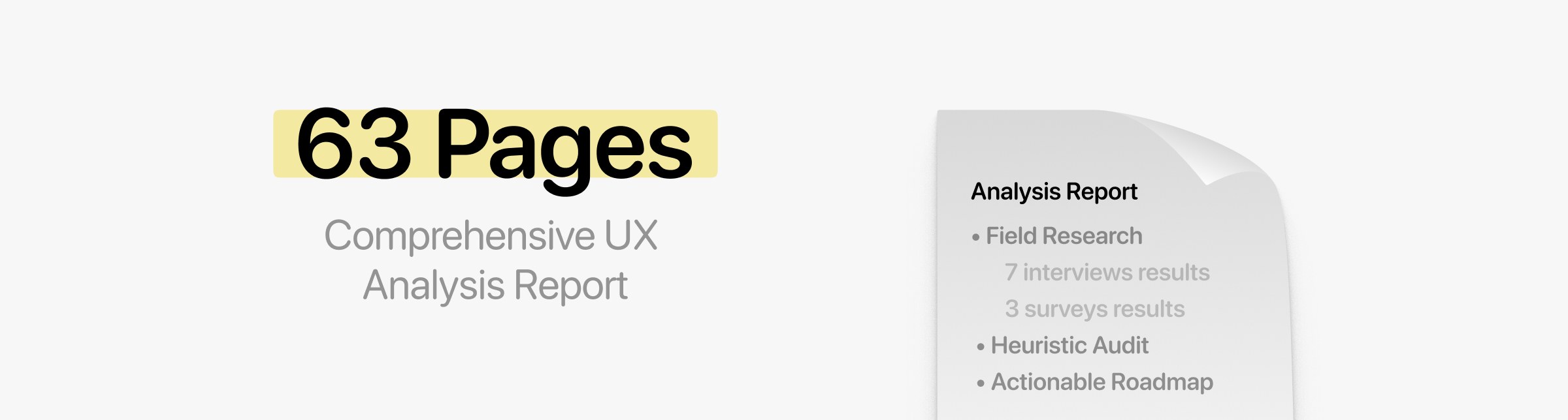
The final deliverables included a 63-page comprehensive UX analysis report detailing all 28 usability blockers and 25 technical specifications. Knowing that long reports rarely get read in full, I also put together a presentation highlighting the six most impactful strategic ideas.
The engineering leads at Airbus Helicopters and Telespazio agreed with the findings and formally approved the recommendations.
Looking back, stepping away from formal observations and just talking to instructors in their environment was the right call. It showed me that no matter how detailed a technical simulation is, it won’t work if the interaction design ignores human cognitive limits.